Common Mistake #1: Choosing a Place Card Holder That Feels Out of Place
Many hosts grab any random holder without considering the overall table setting. A heavy glass block or a shiny plastic stand can clash with a soft, natural tablescape. The result? Your seating cards look like an afterthought instead of an intentional detail.
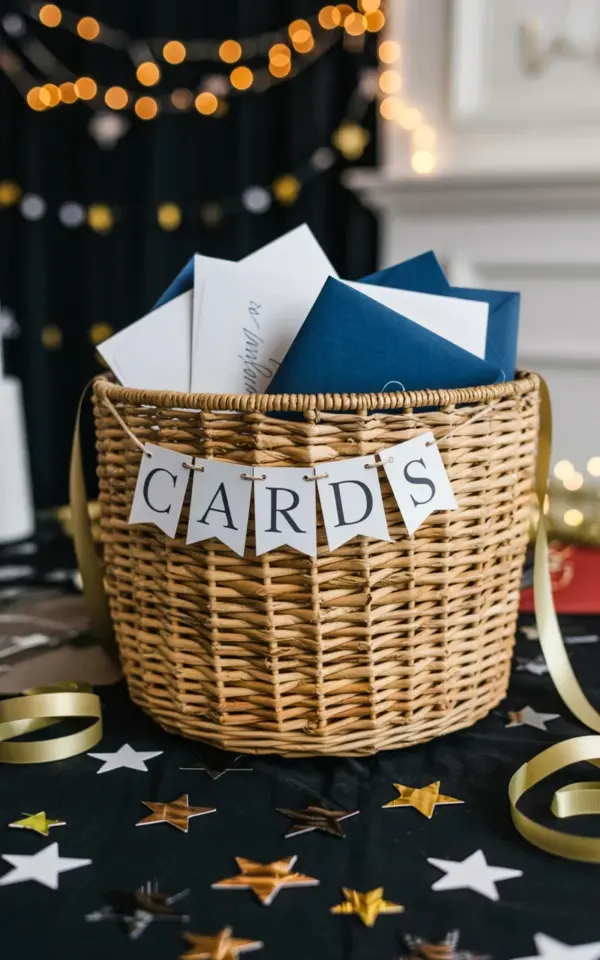
Instead, pick a holder that echoes the mood of your decor. A woven jute basket, like the one in our photo filled with white and navy envelopes, brings warmth and organic texture. It pairs beautifully with a black tablecloth and metallic accents such as gold and silver star cutouts. The basket itself becomes a subtle centerpiece, not just a functional tray.
Common Mistake #2: Overlooking the Role of Texture in Your Tablescape
A flat surface with only smooth plates and shiny cutlery can feel cold. Texture adds visual depth and makes guests want to reach out and touch something. If your table is all gloss and no grain, it lacks a welcoming layer.
Look at the jute basket in the image: its braided, rough weave contrasts with the crisp envelopes and the smooth black tablecloth. You can introduce texture through linen napkins, wooden chargers, or a burlap runner. Even the star cutouts, with their metallic shine against a dark background, add a subtle tactile contrast. Avoid making everything match perfectly; let different surfaces speak to one another.
Common Mistake #3: Forgetting to Balance Color and Contrast
Too many neutral tones wash out your table. Too many bright colors overwhelm the eye. The trick is to anchor your palette with one or two strong hues and repeat them in small doses. Without a deliberate color strategy, your place card display can disappear into the tablecloth or shout for attention.
In our example, the white and navy envelopes stand out clearly against the black background. The navy creates a quiet pop of color, while the white keeps things crisp. Gold and silver stars scattered around the basket echo the metallic tones. To avoid this mistake, choose a main color (navy, burgundy, or emerald) and a neutral base (white, cream, or black). Use your card holders and envelopes to reinforce that scheme, not fight it.
Common Mistake #4: Making Seating Cards Too Complicated to Read
Guests should glance at your display and find their name in seconds. If the font is too fancy, the card too small, or the envelope obscured by ribbon, you create confusion at the door. A pretty holder means nothing if people have to squint or fiddle with folds.
Keep your envelopes unsealed and the cards inside visible. In the photo, the white banner with black text reading “CARDS” is a clever cue that tells guests exactly what to pick up. Use high-contrast ink on your envelopes, like navy calligraphy on white or white ink on navy. Avoid script fonts smaller than 14 points. If you use a basket, fan the envelopes slightly so each one is easy to grab without digging.
Common Mistake #5: Neglecting the Small Decor Accents Around Your Card Holder
Many people place their card holder on the table and call it done. But the space around the holder can make or break the vignette. Blank tablecloth next to a basket looks unfinished, while too many decorations crowd the focal point.
Scatter a few metallic star cutouts around the base of the jute basket, as shown in the photo. These tiny accents draw the eye and create a festive feel without overwhelming the simplicity of the envelopes. You can also add a sprig of greenery, a few loose pearls, or mini pinecones depending on the season. Just keep the arrangement loose and asymmetrical, not lined up like soldiers. The goal is to frame the basket, not bury it.
Common Mistake #6: Skipping the Dry Run Before the Party
I have made this mistake myself. I assembled everything the day of the party, only to realize the basket was too small for the number of guests or the envelopes clashed with the napkins. A dry run saves you from last minute panic.
Set up your entire table at least two days ahead. Place the jute basket where it will sit, fill it with all the envelopes, and arrange the star cutouts. Step back and check visibility from different angles. Ask yourself these questions:
- Can you read the names from three feet away?
- Does the basket feel balanced with the rest of the table decor?
- Are the metallic stars staying in place or sliding off the tablecloth?
- Is the “CARDS” banner straight and fully visible?
Make small adjustments, like tilting a few envelopes outward or swapping a star for a larger one. A full rehearsal ensures your elegant envelope display works exactly as intended on the night.
Putting It All Together
An elegant dinner party table setting doesn’t require a big budget or a designer’s eye. It just needs thoughtful choices and a few common pitfalls avoided. Start with a natural jute basket as your place card holder, pair it with white and navy envelopes, and add metallic accents like gold and silver stars on a dark tablecloth. Keep the reading easy, the textures varied, and the colors balanced. Your guests will feel the care before they even sit down.
Try these tips at your next dinner party. Have you used a basket as a card holder before? I would love to hear how it turned out in the comments below.
#dinnerpartydecor #tablesettingideas #placecardholder #eleganttablescape #partydecorideas
This post was researched and drafted with AI assistance, then personally reviewed and edited by Fern before publishing.
Leave a Comment